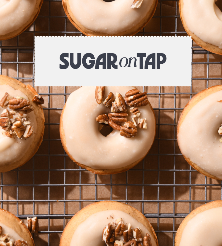
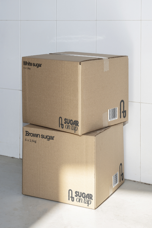
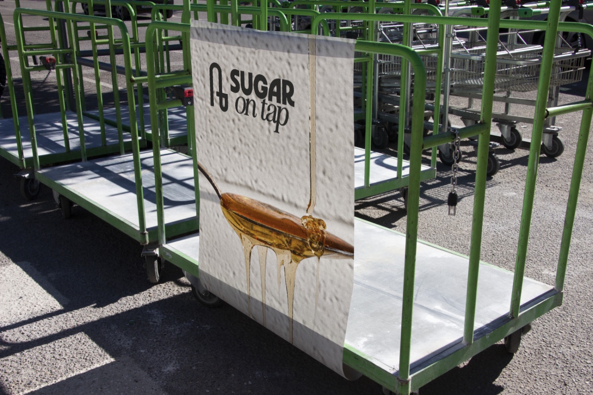
Sugar on tap
Reliable sugar distribution built on legacy and trust
Brand condition
Established and operational, with strong industry relationships already in place. Sugar on Tap had grown from years of hands-on industry experience and dependable service.
The existing brand felt dated and visually unattractive. It made the company appear smaller and less established than it truly was. The business had evolved over 2,5 decades, but brand had been left behind.
Modernisation became a central priority.
The existing brand felt dated and visually unattractive. It made the company appear smaller and less established than it truly was. The business had evolved over 2,5 decades, but brand had been left behind.
Modernisation became a central priority.
Inner tension
Sugar on Tap operated in an industry built on reliability and long-term loyalty, yet its brand presentation did not inspire immediate confidence. The 230-year-old visual identity was no longer communicating their custom approach or the personal connection they have with their clients.
This created internal friction.
The owner did not feel proud or delighted by his brand and began noticing younger competitors gaining attention despite their lack of experience, knowledge, and reputation.
This created internal friction.
The owner did not feel proud or delighted by his brand and began noticing younger competitors gaining attention despite their lack of experience, knowledge, and reputation.
Way forward
A large part of this work was bringing clarity to how the brand could move forward while still honouring its history.
Together, we defined:
- how to modernise the brand without erasing its past
- how to introduce meaning and intention into the identity system
- how to move from decorative or arbitrary visuals toward purposeful design that is practical to implement
- how to balance industrial credibility with a more human, approachable presence
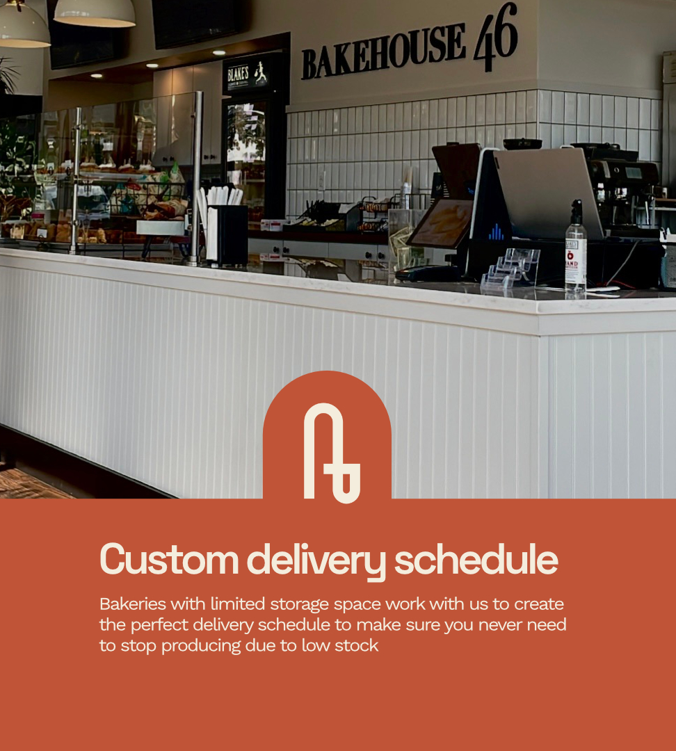
- how to present Sugar on Tap as a long-term partner rather than a commodity supplier
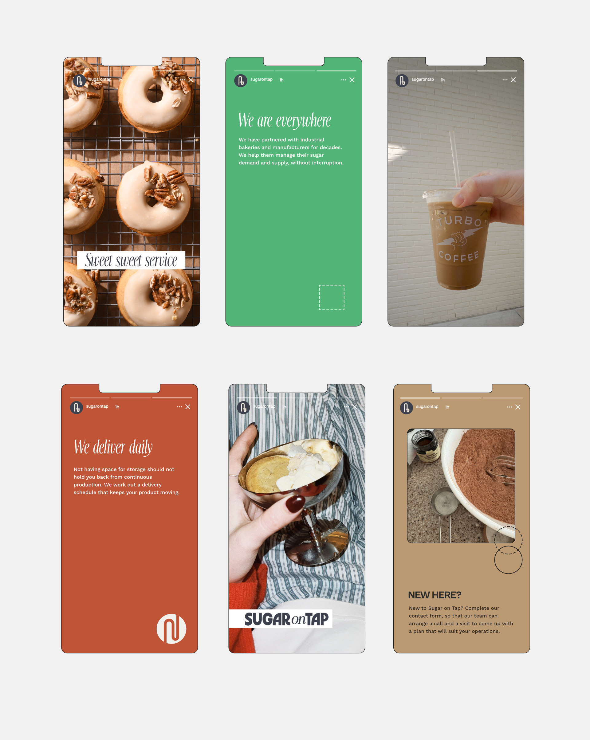
The result was a brand that feels current, structured, and confident — while remaining approachable and grounded.
Together, we defined:
- how to modernise the brand without erasing its past
- how to introduce meaning and intention into the identity system
- how to move from decorative or arbitrary visuals toward purposeful design that is practical to implement
- how to balance industrial credibility with a more human, approachable presence
- how to present Sugar on Tap as a long-term partner rather than a commodity supplier
The result was a brand that feels current, structured, and confident — while remaining approachable and grounded.
Services
Brand strategy
Brand identity Design
Stock Image selection
Website Design
Showit Development
Brand identity Design
Stock Image selection
Website Design
Showit Development